
|
As everyone should know, summer does not last indefinitely, so it's time to get back on track. I've no doubt forgotten a few things (though not as much as a subject like math) so it's time to brush up on a few skills. (Like remembering to check if there's a blog post and not waking up in a cold sweat to do so.) The main thing that's really stuck with me though are the principals of design. Basically, what makes this design look good? 99designs.com/blog/tips/principles-of-design/ Well, while I have only learned the base four in class, being proportion, repetition, balance and contrast, this article here goes further in depth on the 7 base principals of design. I usually use these frequently with various art projects as well as a few other unmentioned rules like the rule of thirds, colors and their perceived effect on our psyche, and how shapes and lines direct our attention. To briefly explain what the article says, the first thing that is different is emphasis. Basically the rule is to make the most important part about your subject stand out. To go on Movement is defined as the way your eyes move from one subject to another, and a great image will have your onlooker either continuously scanning the image in a visual loop of sorts, or consistently lead them to the most important parts of your creation. The last new element is white space, which focuses on what isn't added. Simply put, it's mostly used to separate elements so that the viewer doesn't get overwhelmed. However, this appears to be all that I could easily find so hopefully I'll be able to brush up on some of my other skills as well soon.
0 Comments
|
Creator InfoThis is a blog for a Game Art Design class. Future programmer and currently an artist and writer. 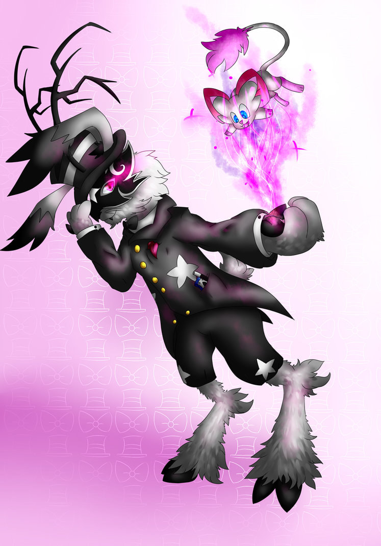
Archives
June 2019
Categories
All
|
 RSS Feed
